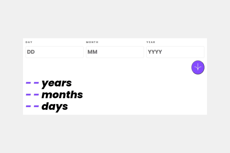
Design comparison
SolutionDesign
Solution retrospective
What are you most proud of, and what would you do differently next time?
understanding more the issue that is possible when using grid or flex
What challenges did you encounter, and how did you overcome them?for the inputs, it's overflowing the width when I use a grid and place-items center for the body to center content
Please log in to post a comment
Log in with GitHubCommunity feedback
No feedback yet. Be the first to give feedback on oualid bennahia's solution.
Join our Discord community
Join thousands of Frontend Mentor community members taking the challenges, sharing resources, helping each other, and chatting about all things front-end!
Join our Discord
