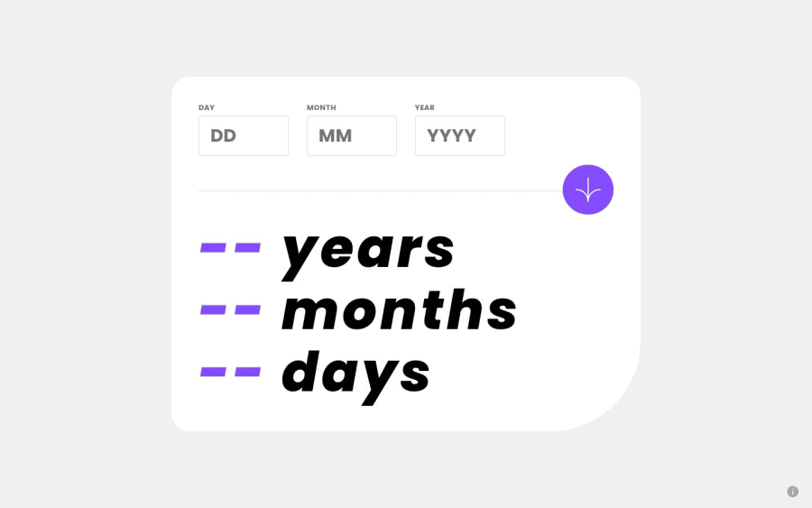
Design comparison
Solution retrospective
Hello world!, This is my solution to this challenge, Any feedback is welcome :D
Please log in to post a comment
Log in with GitHubCommunity feedback
- @Shalom2935
/* remove spin buttons */

/* Chrome, Edge, Opera*/

input[type=number]::-webkit-inner-spin-button {

    display: none;

}

/* Firefox,  Safari */

input[type=number] {

    -moz-appearance: textfield;
    -webkit-appearance: textfield;

}
This will help you remove the spin buttons while hovering or focusing on the input. This solution is the prettiest one I have seen that far and I'm literally fan of the animations. I just figured out a situation I have yet to take into account and it seems you also missed it: What will happen if not the year but globally the input date is higher than today? maybe 5 april 2023. That must be fixed.
Marked as helpful
Join our Discord community
Join thousands of Frontend Mentor community members taking the challenges, sharing resources, helping each other, and chatting about all things front-end!
Join our Discord
