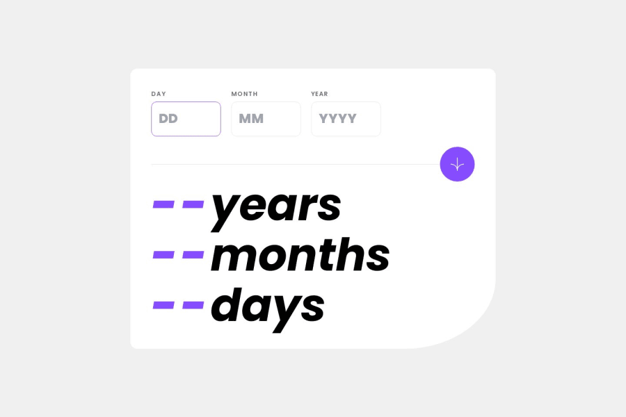
Age calculator app, React, Tailwind, react-hook-form, moment.js
Design comparison
Solution retrospective
I am happy to complete the challenge along with the bonus section of making the numbers increment up to their value. I think the overall code is quite clean too.
What challenges did you encounter, and how did you overcome them?Initially it was the bonus challenge part, however after going away and coming back to it I realised I was overthinking how to tackle it and the solution in the end was quite simple.
What specific areas of your project would you like help with?Any feedback is welcome
Community feedback
- @mohammed-aljablaiPosted 5 months ago
Try to get the same size in the design as possible.
You can make the line hight lower. And the size of place holder bigger. In addition focuse in the color. Like tha background is darker than the design, I hope that I helped you by my feedback.
1P@jambanixPosted 5 months ago@mohammed-aljablai Hi Mohammed,
Thanks for the feedback. I have made some changes to get it closer to the design; admittedly for this one the focus was on the functionality and I took my eye off the ball on some things.
Thanks!
0
Please log in to post a comment
Log in with GitHubJoin our Discord community
Join thousands of Frontend Mentor community members taking the challenges, sharing resources, helping each other, and chatting about all things front-end!
Join our Discord
