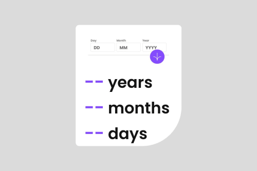
Age-calculator-app

Solution retrospective
I'm most proud of using the CSS reset to start now and in the future with other challenges. I've seen it eliminate some code I don't have to add in specific projects.
What challenges did you encounter, and how did you overcome them?Challenges I encountered were my input tags on mobile stacking in a column when, for example, I would act like an end user, forgetting to put in the correct numbers in their box and have the error text display. I fixed this by creating a fieldset tag to wrap the inputs and display them in a row for mobile and desktop devices.
What specific areas of your project would you like help with?I would like to receive feedback on a specific challenge I encountered. A community member had already provided me with a suggestion, but I wanted to share my experience as well. I attempted to use flex-wrap: wrap to adjust the gap, width, and height of the inputs in order to eliminate the width specified in ch units around the div with the class .input-group. However, I ended up facing a stacking issue once again. I reverted to my previous code, which worked, but I still seek feedback on how to achieve this without relying on a gap property or width specified in ch units.
Please log in to post a comment
Log in with GitHubCommunity feedback
No feedback yet. Be the first to give feedback on Eric Aguayo's solution.
Join our Discord community
Join thousands of Frontend Mentor community members taking the challenges, sharing resources, helping each other, and chatting about all things front-end!
Join our Discord