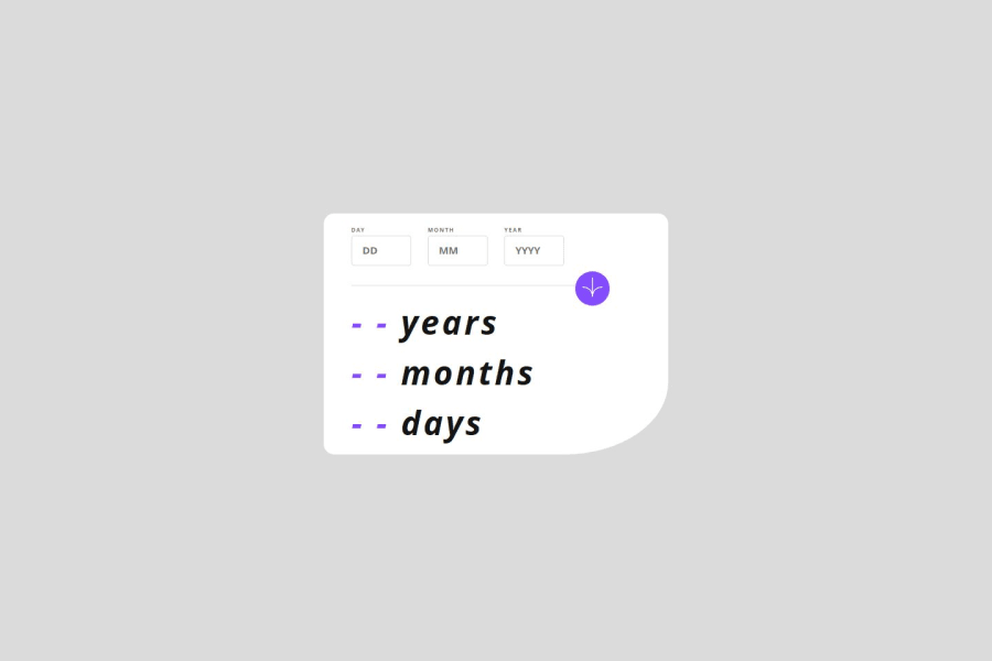
Design comparison
SolutionDesign
Community feedback
- @alberto-rjPosted 8 months ago
Hi, @ydctnr! I'm Alberto.
Congratulations, your solution is working great!
-
But you could improve it by increasing the card width and font size to get closer to the design.
-
It is a good practice to use the Mobile-First approach instead of the Desktop-First approach when you are dealing with Responsive Design.
Marked as helpful0 -
Please log in to post a comment
Log in with GitHubJoin our Discord community
Join thousands of Frontend Mentor community members taking the challenges, sharing resources, helping each other, and chatting about all things front-end!
Join our Discord
