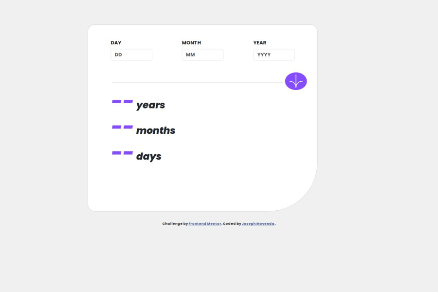
Design comparison
SolutionDesign
Solution retrospective
Styling the button was a bit hard especially for a smaller screen, and the radius. And calculations for the age also gave me a hard time. Otherwise best practices are very much welcome
Community feedback
Please log in to post a comment
Log in with GitHubJoin our Discord community
Join thousands of Frontend Mentor community members taking the challenges, sharing resources, helping each other, and chatting about all things front-end!
Join our Discord
