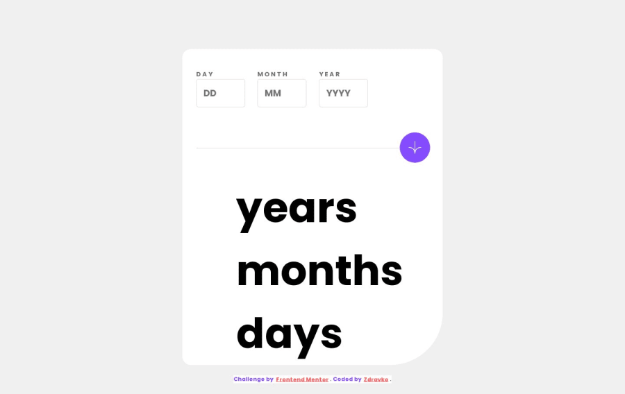
Design comparison
Solution retrospective
I liked this challenge, and had lots of fun buliding it. The biggest challenge for me was code refactoring, making it look more readable and splitting code into modular pieces, while trying not to repeat myself.
Community feedback
- P@KrishnaVishwakarma1595Posted about 1 year ago
Hello, @Zdravko93
I've some points for you to improve the solution -
-
Your body has
overflow: hiddenand because of that I'm not able to scroll because some of the part of the container is hidden. Instead, provideoverflow-y: autoto the body. -
That's nice that you provided the modal for the error message. But, If we try to submit an empty form it shows the modal, as well as the error message for the day field. I think if you want to show the error message too, then show it for all fields otherwise don't show them just mark the field border red.
-
If I fill the day field with a valid value for example:
15and hit submit button. It shows the error modal and the error message as well for the day field like "Must be a valid date", instead it should show the message for other fields, cause the day field has the valid value. I think you must check the error handling once. -
You can provide a
min="1"attribute to the input fields so the user won't be able to decrease the values to negative values using the keyboard arrow down/up keys.
I hope these points will help you to make your solution better. Keep mentoring!
Happy Coding
Marked as helpful0 -
Please log in to post a comment
Log in with GitHubJoin our Discord community
Join thousands of Frontend Mentor community members taking the challenges, sharing resources, helping each other, and chatting about all things front-end!
Join our Discord
