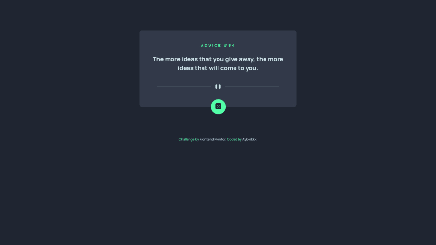
Design comparison
SolutionDesign
Community feedback
- @HikmahxPosted over 1 year ago
Hi Abork š. Nice work! I have some suggestions for you:
- For the pattern divider svg when in mobile view, it's better to change the original width,
width=250px
, to the max-width instead. The reason is that in smaller devices the image overflows to the right. By changing the width to 100%, it makes sure it doesn't overflow, and adding a max-width property will make the width stop increasing on larger devices like tablets. Setting the margin to auto helps center the image when it reaches its max width.
.mobile-img { width: 100%; max-width: 250px; margin: auto; }
- For the main container, it is better instead of setting the width to 25% to give it a width and max-width property like the above. This way the container doesn't become stretched as the screen width increases.
.main-container { width: 100%; max-width: 520px; }
Hope this helps
Marked as helpful0@ayberkkkPosted over 1 year agoHi @Hikmahx š , I have set the img tag as attr because in some versions of mobile safari, the device does not support the width and height properties given by CSS, thank you for your suggestions, I will take it into account.
0 - For the pattern divider svg when in mobile view, it's better to change the original width,
Please log in to post a comment
Log in with GitHubJoin our Discord community
Join thousands of Frontend Mentor community members taking the challenges, sharing resources, helping each other, and chatting about all things front-end!
Join our Discord