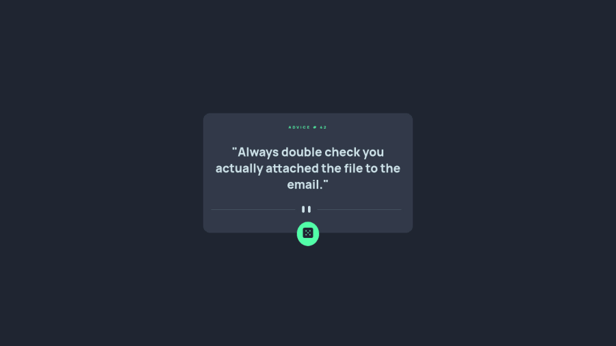
Design comparison
SolutionDesign
Community feedback
- @romila2003Posted over 2 years ago
Hi Bruno,
Congratulations 🎉 for completing this challenge, your API component looks great, and it is great that you used
flexto center the card. I have some suggestions I want to address:- It is best practice to wrap the main content within the
maintag which would ensure that your content is wrapped within the correct landmarks e.g.<main class="container"></main> - Since you have a
max-widthon your card, there is no need to use a media query. - Even though your API is functional on normal browsers, it won't work on Firefox without the clear cache e.g.
fetch(URL, {cache: 'no-cache'})
Overall, great work and wish you the best for your future projects 👍.
0 - It is best practice to wrap the main content within the
Please log in to post a comment
Log in with GitHubJoin our Discord community
Join thousands of Frontend Mentor community members taking the challenges, sharing resources, helping each other, and chatting about all things front-end!
Join our Discord
