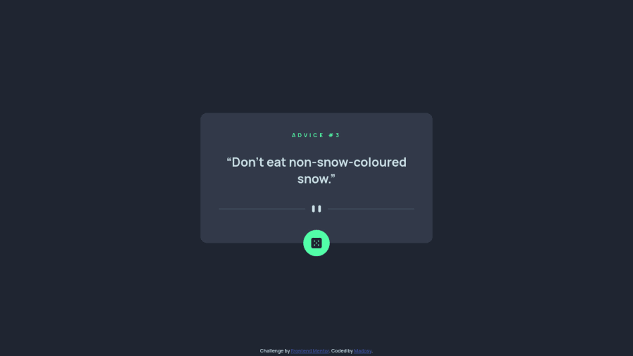
Design comparison
Solution retrospective
I found it difficult to make it look right for Galaxy Fold. It would mess with my grid/flexbox.
I had to use query selector inside my .then statements. It did not work right outside of it. I do not think this is best practice as examples I saw did not do this and declared outside of it first.
Community feedback
- @Itskrish01Posted over 1 year ago
Hey, I just checked and discovered that every time I click the button it does not show me new advice. To fix this you can use the boolean isLoading state to check if the advice is isLoading and add a loading animation and disabled the button while the isLoading is true, add debounce so you can show the data every time you click the button. because right now when I click the button I make another request when the previous one is not even completed you can fix it by using this method.
Marked as helpful1@madosyPosted over 1 year ago@Itskrish01 Appreciate the feedback! I will try implementing your suggestion to the solution. :)
0 - @0xabdulkhaliqPosted over 1 year ago
Hello there š. Congratulations on successfully completing the challenge! š
- I have other recommendations regarding your code that I believe will be of great interest to you.
HTML š·ļø:
- This solution generates accessibility error reports, "All page content should be contained by landmarks" is due to
non-semantic
markup, which lack landmark for a webpage
- So fix it by replacing the
<div class="advice-container">
element with the semantic element<main>
along with<div class="attribution">
into a<footer>
element in yourindex.html
file to improve accessibility and organization of your page.
- What is meant by landmark ?, They used to define major sections of your page instead of relying on generic elements like
<div>
or<span>
- They convey the structure of your page. For example, the
<main>
element should include all content directly related to the page's main idea, so there should only be one per page
HEADINGS ā ļø:
- And, this solution has also generated accessibility error report due to lack of level-one heading
<h1>
- Every site must want at least one
h1
element identifying and describing the main content of the page.
- An
h1
heading provides an important navigation point for users of assistive technologies, allowing them to easily find the main content of the page.
- So we want to add a level-one heading to improve accessibility by reading aloud the heading by screen readers, you can achieve this by adding a
sr-only
class to hide it from visual users (it will be useful for visually impaired users)
BUTTONS š²ļø:
- This solution had generated accessibility error reports due to lack discernible text for
<button>
element
- The
<button>
must have discernible text that clearly describes the destination, purpose, function, or action for screen reader users.
- Screen reader users are not able to discern the purpose of elements with role="link", role="button", or role="menuitem" that do not have an accessible name.
- The
<button>
name rule has five markup patterns that pass test criteria:
<button id="al" aria-label="Name"></button> <button id="alb" aria-labelledby="labeldiv"></button> <div id="labeldiv">Button label</div> <button id="combo" aria-label="Aria Name">Name</button> <button id="buttonTitle" title="Title"></button>
-
Ensure that each
<button>
element and elements withrole="button"
have one of the following characteristics:- Inner text that is discernible to screen reader users.
- Non-empty
aria-label
attribute. aria-labelledby
pointing to element with text which is discernible to screen reader users.role="presentation"
orrole="none"
(ARIA 1.1) and is not in tab order (tabindex="-1"
)
. .
I hope you find this helpful š Above all, the solution you submitted is great !
Happy coding!
Marked as helpful0
Please log in to post a comment
Log in with GitHubJoin our Discord community
Join thousands of Frontend Mentor community members taking the challenges, sharing resources, helping each other, and chatting about all things front-end!
Join our Discord