Design comparison
Solution retrospective
Any suggestions to improve are much appreciated. Thanks!
Community feedback
- @NaveenGumastePosted about 3 years ago
Hello Jared Silver ! Congo 👏 on completing this challenge
Let's look at some of your issues, shall we:
- Just one suggestion Always use
h1first and thenh2,h3and so on
happy Coding😀
Marked as helpful0 - Just one suggestion Always use
- P@dwhensonPosted about 3 years ago
hey @jsilver88 well done on this challenge! Looking good 🙌 !
Here's a few points to think about:
- HTML: You will notice the validtor is complaining about you having a
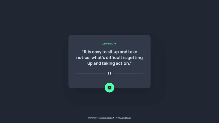
h4element without any headings of a higher level above it. What this means is that you should use the <h1> headings as main headings of your web page, followed by the <h2> headings, then the less important <h3> headings, and so on, without skipping a level.
This is really important as many people using assistive tech to access your pages will navigate the site based on the heading structure. We shouldn’t use headings to make text look BIG or bold. Use them only for setting out the heading of your document and to show the document structure. In this case using a
h1and adding the styles from theh4to it should solve this issue.-
CSS: My only suggestion here is to remove the
heightsetting on yourcontaineras it causes elements to overlap depending on the length of the returned text. Generally if you are setting a height on something you should have a good look at what you are doing as it often causes issues. In this case you could remove it completely or just change it tomax-heightwhich will allow elements to grow if needed. -
JS: I would suggest you add a check to ensure the API has responded correctly, and render an error message if not. This isn't too tricky, and I would just change your
datavariable to be:
response.ok ? response.json() : throw new Error("API Failed")If you then add a
catchat the end of of your fetchAdvice function you can render some fallback text in case things don't work for any reason. It's not a big deal, but thinking about how things can go wrong is a good habit to get into.Hope this helps!
Keep up the good work!!! 👍
Cheers 👋
Dave
Marked as helpful0P@jsilver88Posted about 3 years ago@dwhenson Thanks for the useful suggestions on how to better improve this. I appreciate you.
0P@dwhensonPosted about 3 years ago@jsilver88 Thanks. Just updated my comment as for CSS I should have said
max-height0 - HTML: You will notice the validtor is complaining about you having a
Please log in to post a comment
Log in with GitHubJoin our Discord community
Join thousands of Frontend Mentor community members taking the challenges, sharing resources, helping each other, and chatting about all things front-end!
Join our Discord
