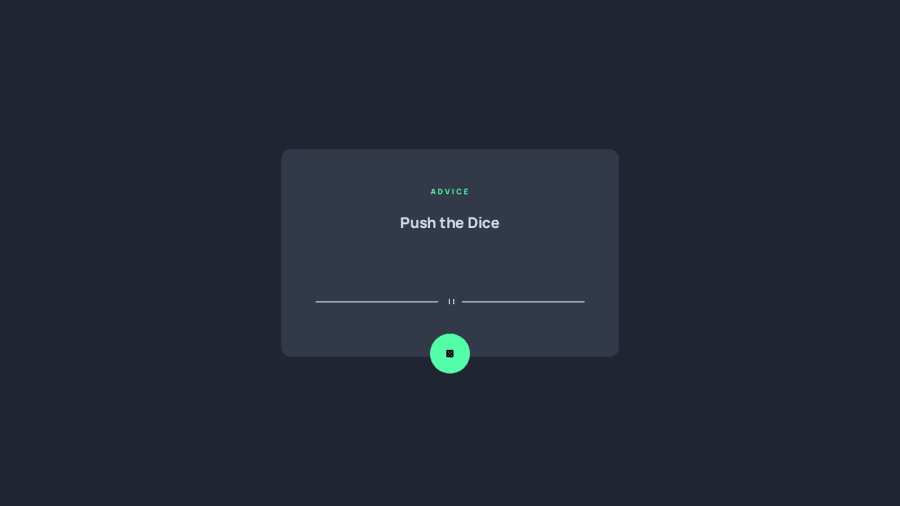
Design comparison
Solution retrospective
Will be glad to hear your opinions
Community feedback
- @RubenSmnPosted about 2 years ago
I see that you made a custom line instead of using the provided svg. That looks really good!
I did find some things you could improve upon:
-
The icon in the button is very small.
-
A transition effect on the shadow to create a more fluid effect.
-
Increase the usage of semantic elements, currently you're building a lot with
divelements. These are a great way of getting to look semantic elements the way you want.
For example your
divwith the container class could be amainand you could switch thespanandpto a heading tag (h1,h2).I hope you find this useful!
Marked as helpful0 -
Please log in to post a comment
Log in with GitHubJoin our Discord community
Join thousands of Frontend Mentor community members taking the challenges, sharing resources, helping each other, and chatting about all things front-end!
Join our Discord
