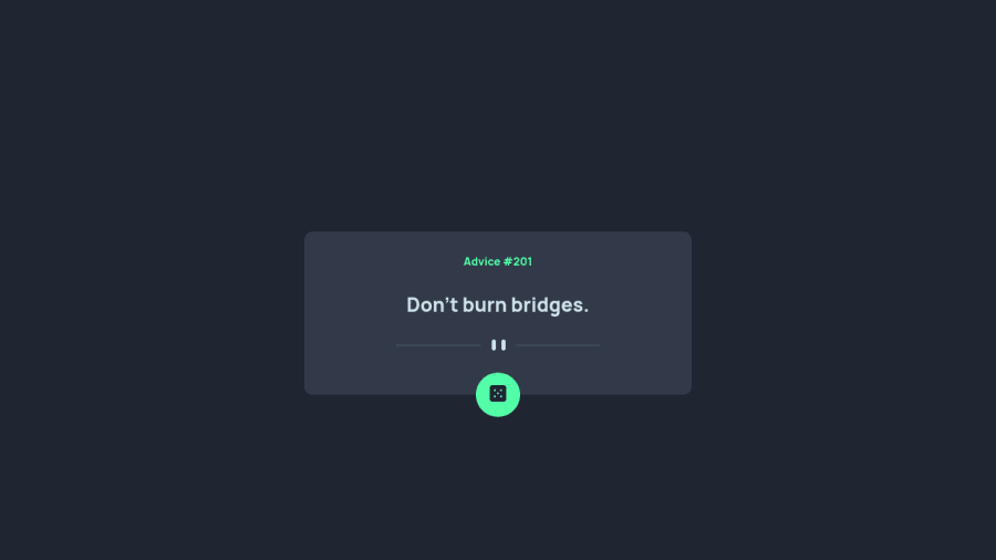
Design comparison
Solution retrospective
Hi All,
After some good comments I did some amendment, please check and please let me know if there is anything else I should change!!! Thanks so much!
Community feedback
- @GregLyonsPosted over 2 years ago
Looks good, and cool to hear that you took the time to update it after receiving feedback! I have a couple suggestions as well:
1) It's subtle, but there's actually a separate divider for mobile and for desktop (your divider line looks a lot smaller in desktop mode than in the design). One thing I learned yesterday (shout out to @isprutfromua was that you can use a
<picture>element to change which image is displayed based on the viewport width. Read this for more info. I find that a lot of these Frontend Mentor challenges change the image based on the viewport dimensions, which is quite common and also precisely what this<picture>element is for.2) I see you put your
:hoverpseudoselector in a media query. I'm assuming you intend for the:hoverto not activate on mobile/touch screen devices. That's actually something I haven't thought about before, and after reading a little bit it does seem like having:hoverstates on touch devices can be a bit disruptive. I feel like, though, that it's a bit dangerous to just usemin-width: 50remto detect this. I found the answers to this StackExchange question to be pretty helpful. It looks like you could use different properties in your media queries than just the width.I hope this helps!
Marked as helpful0@SuprefunerPosted over 2 years agoHi @GregLyons,
Thanks for your comments!
- haven't used <picture> before and it's so useful! thanks for sharing!
- don't know that I could use hover in my media query. Another new inspiration!
1@GregLyonsPosted over 2 years ago@Suprefuner No problem! I didn't know I could use hover in my media query either until I found that stack exchange solution while investigating 2 lol
I think you can use media queries to search for a lot of device capabilities like that, so I'm keeping that in mind too.
0 - Account deleted
Hello there! 👋
Congratulations on finishing your challenge! 🎉
I have some feedback on this solution:
-
put the quote inside a <blockquote> tag instead of p to be more semantic
-
check the HTML report to fix accessiblity issues
i hope this is helpful and goodluck!
0 -
Please log in to post a comment
Log in with GitHubJoin our Discord community
Join thousands of Frontend Mentor community members taking the challenges, sharing resources, helping each other, and chatting about all things front-end!
Join our Discord
