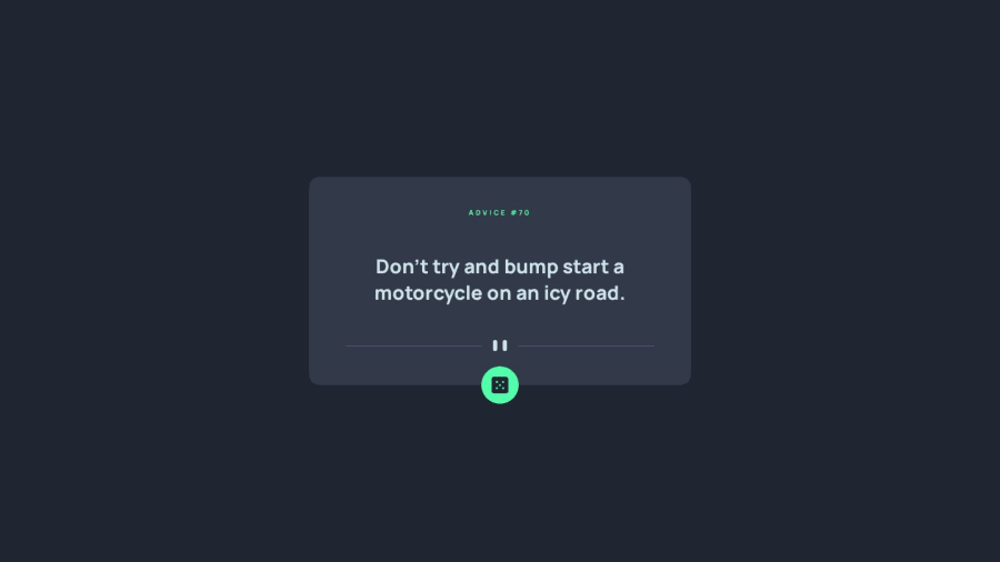
Advice generator using vanilla Javascript, SCSS and AXIOS
Design comparison
Solution retrospective
Hi, all! I am happy to complete this project, but I want to ask you something... in the browser, I can see the responsive design working correctly, but when I see the website on my iPhone, it's not working well, it's like the responsiveness is not applied... and I don't know why. This isn't happening with Android. Maybe if one of you has IOS and wants to test it, or give me any idea of what is going on, I would greatly appreciate it!
Community feedback
- @peanutbutterjllyPosted over 1 year ago
hey 👋,
to simulate phone devices (besides just squishing your browser) you can use the dev tools in Chrome/Firefox/Safari to help simulate those devices:
I used those tools to inspect your page and sure enough, the content does overflow on mobile screens. to help with that, try getting your div.container and removing the
width: 55rem;
and reduce yourmax-width: 55rem
down to 40-50rem - maybe reduce the padding as well.besides that, good job on your solution!
Marked as helpful1@cristinakellytPosted over 1 year agoHey @peanutbutterjlly ! Thanks a lot for your feedback! I will take a look at the width and the links that you provide, I'm sure I will benefit from those. Really appreciate your time reviewing!
1 - @grace-snowPosted over 1 year ago
Hi
You are making some foundational errors in this, like using IDs as class selectors, resizing base font-size all the time and working desktop-first. Not only is this making loads more work for yourself, it is making your solution completely inaccessible.
Here are notes and changes I just made in browser devtools. Go through each note carefully.
It's also worth you reading my post about why resizing html font size like this is a terrible idea. There are some other posts on there that would benefit you too, like the explainer on what the ID attribute is for.
/* style.b95d109e782698da0923.css | https://zk-advice-generator.netlify.app/style.b95d109e782698da0923.css */ main { /* height: 100vh; */ /* width: 100%; */ min-height: 100vh; } .container { /* height: 30rem; */ /* width: 55rem; */ min-height: 30rem; margin: 1rem; note: the container needs an aria-live attribute on it; note: never limit height of text containing elements; note: do not set width, instead only use max width. This lets the component shrink if it needs to; note: the margin ive added to stop the component ever hitting screen edges; padding-bottom: 4.5rem; } #advice-text { /* height: 15rem; */ note: NOT a h1. This is a blockquote or paragraph; note: Do not style on IDs; margin-block: 1.5rem; flex-grow: 1; } #advice { /* letter-spacing: 3px; */ letter-spacing: 0.3em; note: NEVER use pixels for letter spacing. Use em; } @media only screen and (max-width: 36em) { html { /* font-size: 50%; */ note: ESPECIALLY don't do this'; } #advice { /* font-size: 1.2rem; */ } } html { /* font-size: 62.5%; */ note: DON"T do this!"; } #dice { note: Event listeners must never be on non-interactive elements. This MUST be a button; } #dice img { note: The button must have an accessible name that describes what it does. "Dice" is meaningless as a button label; } @media only screen and (max-width: 28em) { html { /* font-size: 40%; */ note: REALLY do not do this!; } } @media only screen and (max-width: 22em) { .container { /* width: 48rem; */ } #advice { /* font-size: 1.4rem; */ } } img { note: Decorative image so alt must be blank; } img { display: block; max-width: 100%; note: This is usually part of a modern css reset. You should always use one at the start of your styles.; }
Marked as helpful0@cristinakellytPosted over 1 year agoHi @grace-snow! I really appreciate your feedback and input. I read your articles and I can say that I agree with them, accessibility is not a topic that I have dived into yet, but for sure, I will dive deep soon. I learned in a course to resize
font-size
to 62.5% and also to resize in media-query, so in this way, would be easier to adjust the other elements in different breakpoints. But after reading your article, I see that this is a bad practice. Certainly, I will not do this in my future projects, and later I will fix this one.1@grace-snowPosted over 1 year ago@cristinakellyt I'm glad it helped. Keep going with your dev journey, I hope you enjoy
0
Please log in to post a comment
Log in with GitHubJoin our Discord community
Join thousands of Frontend Mentor community members taking the challenges, sharing resources, helping each other, and chatting about all things front-end!
Join our Discord