Submitted about 2 years ago
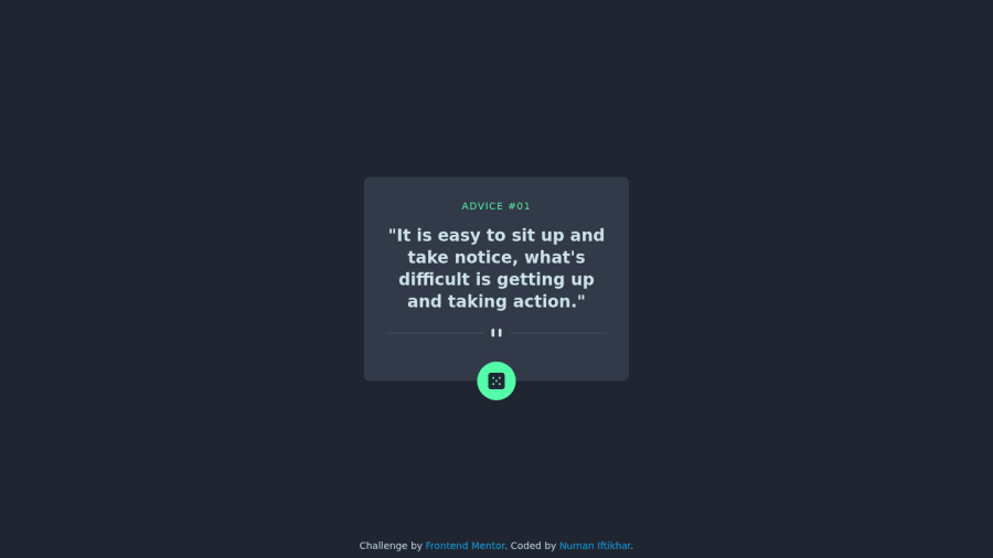
Advice generator using tailwind and fetch api
@numan-iftikhar
Design comparison
SolutionDesign
Solution retrospective
- Point out helpful resources for learning more about fetching data form an external api
Community feedback
- @grace-snowPosted about 2 years ago
There are a few issues I notice on this straight away
- it doesn't quite look like the design in size and text styles
- The divider has completely wrong alt. If that is decorative it should have empty alt
- The dice has no alt which means the button has no label. There is no indication what clicking it would do
- There needs to be an aria-live attribute on this component so that assistive tech are told when content changes
- The footer being absolutely positioned means it overlaps the component at times, sometimes making the dice button unclickable as it's got an anchor tag on top of it
0
Please log in to post a comment
Log in with GitHubJoin our Discord community
Join thousands of Frontend Mentor community members taking the challenges, sharing resources, helping each other, and chatting about all things front-end!
Join our Discord
