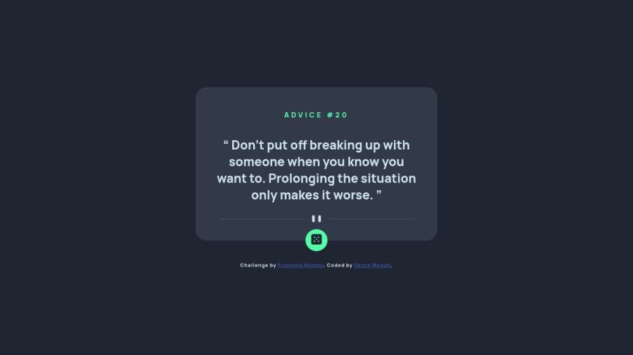
Advice Generator using HTML, CSS and JavaScript
Design comparison
Solution retrospective
A really good project to practice API consumption. I had some problems with the screen sizing, I would appreciate some tips on media queries.
Community feedback
- @HamzaouladevPosted about 2 years ago
hello @okutewonah
here are some tips to make your component more responsive:
-
always keep the height auto so it is up to the content of your component to set it, that way you wont run into overflowing issues.
-
use padding to create the space you need here instead of height, i invite you to read up on the box model to learn more, heres an article about it.
-
set the width of your component relatively eg:
width: 90%;plus give it a max width with a set number eg:max-width: 800px;that way your component will be responsive in all devices
hope you found this helpfull! keep hacking
Marked as helpful1 -
Please log in to post a comment
Log in with GitHubJoin our Discord community
Join thousands of Frontend Mentor community members taking the challenges, sharing resources, helping each other, and chatting about all things front-end!
Join our Discord
