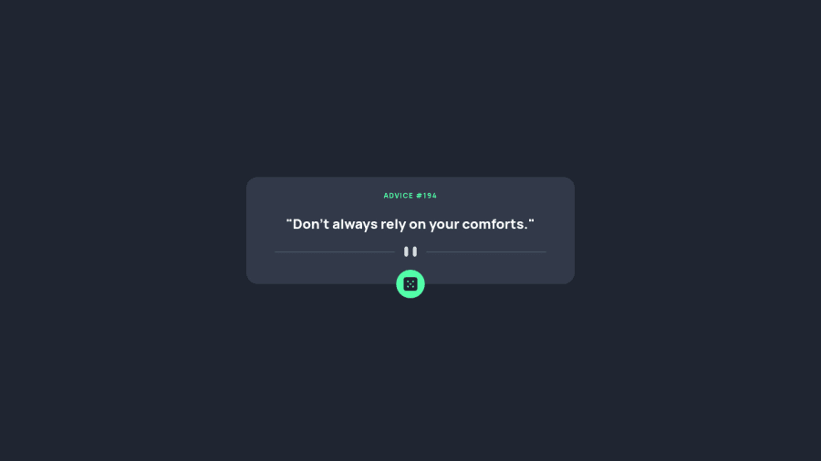
Design comparison
Community feedback
- @Bayoumi-devPosted over 2 years ago
Hey Sharon, It looks good!... Here are some suggestions:
Document should have one main landmark, Contain the component with<main>.
<main> <div class="container"> //... </div> </main>-
Page should contain a level-one heading, Change<p id="advice-no"></p>to<h1 id="advice-no"></h1>You should always have oneh1per page of the document... in this challenge, you will useh1just to avoid theaccessibility issuethat appears in the challenge report... but don't useh1on small components<h1>should represent the main heading for the whole page, and for the best practice use only one<h1>per page. -
use
<button class="dice">instead of<div class="dice">... Buttons are used for actions.
<button class="dice">
      <img src="images/icon-dice.svg" alt="Advice Generator" class="click-dice roll-dice">
</button>
Hope this help!... Keep coding👍
Marked as helpful1@siafromspacePosted over 2 years ago@Bayoumi-dev will work on the code asap. thank you sm !
0
Please log in to post a comment
Log in with GitHubJoin our Discord community
Join thousands of Frontend Mentor community members taking the challenges, sharing resources, helping each other, and chatting about all things front-end!
Join our Discord
