

Design comparison

Solution retrospective
Any feedback is Welcome.
Community feedback
- @elaineleungPosted over 2 years ago
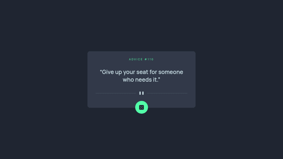
Hi Enoch, great job with this challenge, and as a Firefox user, I'm so happy that I can load the next advice after the first one, as I normally am not able to when I'm viewing most of these solutions. Good job using a random number for that! I also like how you used a loading box to show the loading status in the initial state🙂
My two suggestions here are:
-
It looks like the dice icon button is a bit off centered still; you can try one of these methods for centering:
// method 1: #advice-generator { left: 0; right: 0; margin-inline: auto; } // method 2: #advice-generator { left: 50%; margin-left: -32.5px; // this is the negative value is half the width } -
You can try using flexbox in the main advice container to center everything vertically, because for the short advice lines, there tends to be a lot of whitespace under the divider, which can make it look a bit odd.
That's it for now, great job once again! 😊
Marked as helpful0@iamenochleePosted over 2 years ago@elaineleung thanks for your observation, i will apply the changes. Yeah, i applied a min-height, to the container, lol, i have fixed the issues
1 -

Please log in to post a comment
Log in with GitHubJoin our Discord community
Join thousands of Frontend Mentor community members taking the challenges, sharing resources, helping each other, and chatting about all things front-end!
Join our Discord