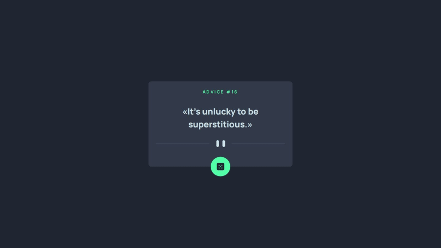
Design comparison
Solution retrospective
Any feedback is welcome 👍
Community feedback
- @Simplify4Me2Posted about 2 months ago
Hi @dev-paulL,
Great solution! A smooth setup using Tailwind, Vite and React ⚡
Just a tiny detail, but I noticed you're using
after:content-['»']and its equivalent for quotes. Maybe try using“and”. Those polished touches can really make a difference!Loving the Tailwind variables, but a little remark —Tailwind’s docs recommend defining them in your
main.cssorindex.cssfile (you can check it out here: Tailwind Customizing Colors). Also, instead of using dark, consider naming with shades (e.g., gray-700), as it might offer more flexibility for future changes.And while I'm being nitpicky, I noticed an empty
altattribute on an image - giving it a meaningful value will help with accessibility, plus it's good for SEO!Overall, great job! Keep up the awesome work and happy coding 🍵🍵
1@dev-paulLPosted about 2 months ago@Simplify4Me2 Hi Simon 👋, both the images are decorative and don't need an alt attribute (the button has an aria-label). About the colors, I'm pretty sure it's about the same, and it's easier that way because I can copy paste them from the styleguide. But in general yes, it's better to name with shades
The quotation marks are the "french touch" 😉🇫🇷
1
Please log in to post a comment
Log in with GitHubJoin our Discord community
Join thousands of Frontend Mentor community members taking the challenges, sharing resources, helping each other, and chatting about all things front-end!
Join our Discord
