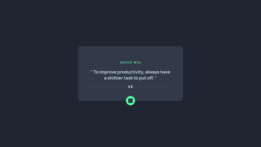
Design comparison
SolutionDesign
Community feedback
- @FarisPalayiPosted almost 3 years ago
Hey, nice job on this one 👍. Here are some of my suggestions:
- set the image
altvalues toalt=""if images are only used for decorative purposes - I think the
altvaluedivideris unnecessary in the divider img because it doesn't provide any useful information or extra context. i.e. since it's decorative. - try adding a
:focusstate style to the button so that people using keyboard to navigate can use the site easily - set an
aria-labelattribute to the button so that the purpose of the button is clear to assistive devices. - also, try using the
blockquotetag instead of thepfor advice, to make the html semantic
Happy coding ✨
Marked as helpful0@mafernandezgoPosted almost 3 years ago@FarisPalayi Thank you for your comments, I will consider them
1 - set the image
Please log in to post a comment
Log in with GitHubJoin our Discord community
Join thousands of Frontend Mentor community members taking the challenges, sharing resources, helping each other, and chatting about all things front-end!
Join our Discord
