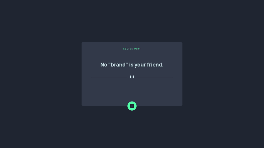
Advice generator project using HTML, CSS, JS, advice API
Design comparison
Solution retrospective
Hi, everyone!
I would really appreciate it if you check my solution and give some feedback on it. Especially, regarding the placement of "pattern" below the advice text. Should it be fixed or is it okay to move it depending on the text length?
Community feedback
- @ApplePieGiraffePosted over 2 years ago
Hello there, Zhansaule Telisheva! 👋
Well done on this challenge! 👍
Here are a few things I'd like to suggest,
- Avoiding using
pxfor setting the value offont-sizein your styles. Instead, use a responsive unit such asemorremso that users will be able to change the size of the text in your site by changing the default font-size of their browser. It might also be worth setting the values for other properties such asmarginorpaddingin those units so that your entire site will scale with the user's chosen default font-size. If you'd like to learn more about those units in CSS and how all of this works, check out this helpful video on the topic. - Avoiding setting specific heights for most of the elements in your page (especially wrapper or container elements). It's often better to simply allow the height of elements to be determined by their content (which is their default behavior) because then they will be just as high as they need to in order to accommodate what's inside them. You can always use margin or padding to add extra space around or inside those elements if desired. In your case, there's no need to worry about keeping the content below the quote in the same place for every quote (since you don't know how short/long each quote will be).
- Setting the
alttext for the icon inside the button that loads another quote to be an empty string so that it will be ignored by screen readers. That’s because that element isn’t necessary or important to the content of the page and as a result doesn’t need to be read by screen readers. - Using more semantic HTML elements in your markup, which is important for accessibility and SEO-related reasons. For instance, the button that loads another quote should be a
buttonelement, the quote itself could be apelement, and the "Advice #93" text could probably be a heading element. If you’d like to learn more about how to write semantic HTML and why it matters, check out this short, helpful course.
Hope you find these tips helpful. 😊
Keep coding (and happy coding, too)! 😁
Marked as helpful1@ZhansauleTPosted over 2 years ago@ApplePieGiraffe Wow, cool, thank You so much for this valuable advice. I highly appreciate that! I'll use your tips in my future projects and check out the courses too:)
1@ApplePieGiraffePosted over 2 years ago@ZhansauleT
No problem! Happy to help! 😊
0 - Avoiding using
Please log in to post a comment
Log in with GitHubJoin our Discord community
Join thousands of Frontend Mentor community members taking the challenges, sharing resources, helping each other, and chatting about all things front-end!
Join our Discord
