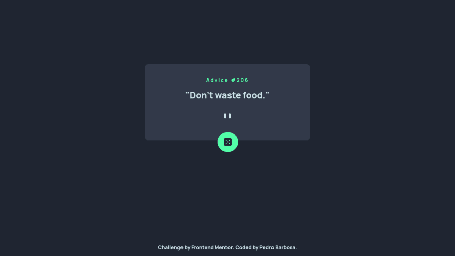
Design comparison
Solution retrospective
Any tips on how to align properly the button with the box that has the quotes ? Currently, the button moves up or down depending on the size of the quotes. Also, the pattern divider does not appear correctly on mobile view.
Community feedback
- @Appz-dkPosted over 1 year ago
You could try:
- setting a max-width of your "advice card".
- Adding justify-content: center (instead of only using align-items: center)
For the mobile version you have to use the mobile version of the divider svg. This can be done with and @media query.
You can if you want, check out my soultion for inspiration (it's made with react).
Also I think there is a abit too much margin between your divider and the button
Hope this helps.
Edit: Maybe also use a <q></q> tag instead of the <blockquote> tag
0
Please log in to post a comment
Log in with GitHubJoin our Discord community
Join thousands of Frontend Mentor community members taking the challenges, sharing resources, helping each other, and chatting about all things front-end!
Join our Discord
