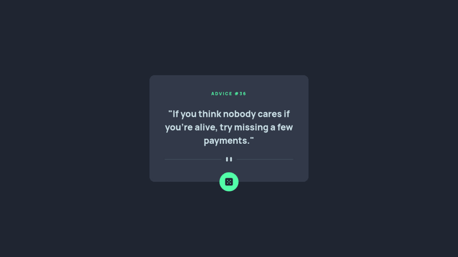
Design comparison
SolutionDesign
Solution retrospective
I appreciate any suggestion to improve my code! Feel free to tell me what I could have done better.
Community feedback
- @romila2003Posted over 2 years ago
Hi Vittorio,
Congratulations for 🎉 for completing your first challenge, the API looks great and is functional. It is great that you used the right semantic and the
flexproperty to center the card. There are some suggestions I want to give:- Your button is missing the
typeattribute - Since you already gave your
.containeramax-width, you do not need to have a media query. Instead, you can give yourbodyamarginproperty to prevent the card touching the side of the screen e.g.margin: 0 10px; - Even though your API is functional on normal browsers, it won't work on Firefox without the clear cache e.g.
fetch(URL, {cache: 'no-cache'})
Overall, great work and wish you the best for your future projects 👍.
0 - Your button is missing the
Please log in to post a comment
Log in with GitHubJoin our Discord community
Join thousands of Frontend Mentor community members taking the challenges, sharing resources, helping each other, and chatting about all things front-end!
Join our Discord
