Design comparison
Solution retrospective
Hi,
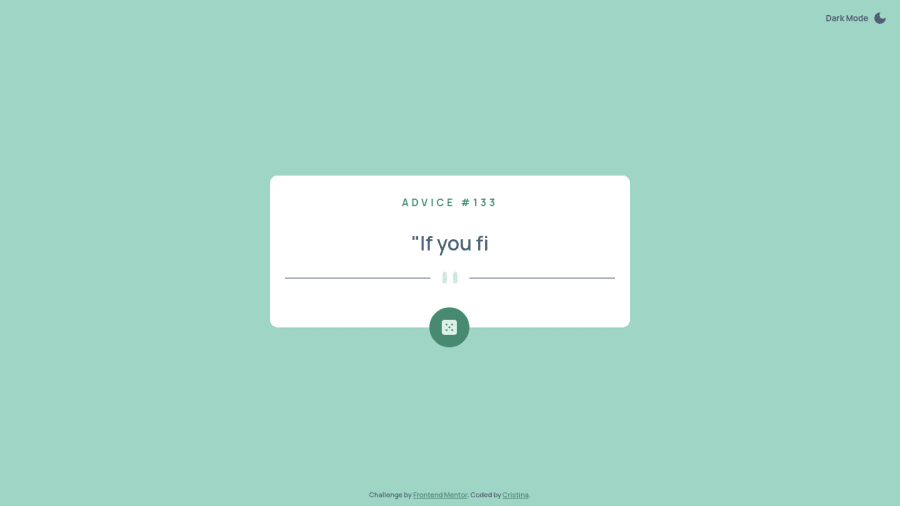
Another great challenge, I enjoyed working on it to practice API integration and CSS grid. I decided to add a theme toggler to the design and also a typewriting effect to the text, I hope you like it. Feedback welcome!
Cheers
Community feedback
- @tanererenPosted about 2 years ago
Hey!
An improvement that you can make is your
.theme-togglerbutton has uneven padding which makes clicking on it quite awkward.theme-toggler { border: none; background-color: inherit; color: var(--primary-300); display: flex; align-items: center; gap: 0.5em; font-weight: 700; padding: 2em 1.5em 0 0; <-- change this to 2em only cursor: pointer;Also when you click the dice button the words aren't being rendered correctly - they're illegible so you may want to check the function - the typewriter effect is good idea though!
Let me know how you get on
Marked as helpful0@cr1deg0Posted about 2 years agoHi @tanereren, thanks for pointing this out. After some digging it seems the problem with the words not being rendered correctly was happening when a new advice was requested before the previous one had finished rendering, as both function calls would be added to the event loop. To avoid this I've disabled the button while the message is rendering. Cheers
1@tanererenPosted about 2 years ago@cr1deg0 Ah interesting!
Maybe a fun task could be adding a function that speeds up the typewriter effect when the box is clicked so you don't have to wait to randomise the advice
0
Please log in to post a comment
Log in with GitHubJoin our Discord community
Join thousands of Frontend Mentor community members taking the challenges, sharing resources, helping each other, and chatting about all things front-end!
Join our Discord
