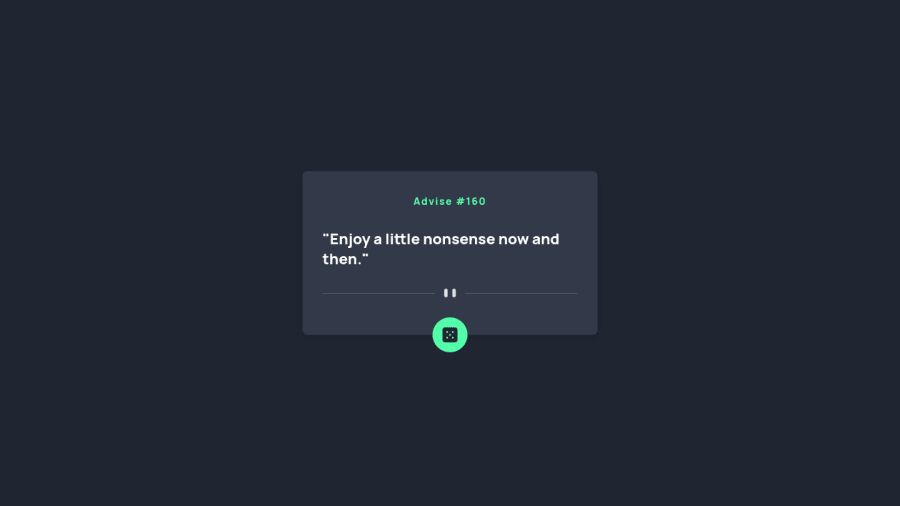
Design comparison
SolutionDesign
Solution retrospective
It was a good task to practice how to fetch the data and use the fetched data in your web app. Plus, I also learned about how to use Tailwind CSS.
Community feedback
- @rizkisirajPosted about 2 years ago
Hi Raj, I really like your submission!
I think it'd be better if u align your advice text to the center, to make the UI more similar to the given design. You can put "text-center" in your advice text's class.
But overall it's a great solution. Keep Coding 😁😁
1@rajkp10Posted about 2 years ago@rizkisiraj thank you for your valuable feedback, i will consider your suggestion.
0
Please log in to post a comment
Log in with GitHubJoin our Discord community
Join thousands of Frontend Mentor community members taking the challenges, sharing resources, helping each other, and chatting about all things front-end!
Join our Discord
