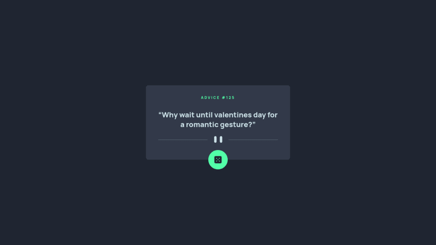
Advice Generator app using React and Tailwind
Design comparison
Solution retrospective
This is my seventh solution submitted here.I've made this little project to experiment and use Tailwind. It was very entertaining and interesting to search and do all the styling on the HTML. It was my very first time doing something similar and I intend to make a bigger project to intensify the challenge. It is a very smart and powerful way of styling, I just think that I need to organize better the order of the classnames to make it easier for maintenance. I'm gonna try using Tailwind again on a bigger project to see how it will scale. Anything you might think that is useful for me to know, please be free to share. Thanks, in advance.
Community feedback
- Account deleted
Hello there! 👋
Congratulations on finishing your challenge! 🎉
I have some feedback on this solution:
- put the quote inside a <blockquote> tag instead of p to be more semantic
i hope this is helpful and goodluck!
Marked as helpful0@WillwfPosted about 3 years ago@Old1337 Thank you for this tip. I'm gonna update to make this change. I didn't remember this tag.
1 - @melwyntPosted about 3 years ago
Hi there!
Good job on the design.
Regarding the dice button, I think you are facing the same issue that I had. I also used React for this project. Please feel free to check my solution here.
Fetch(orAxios) is caching the data. Because of this it will always return the same value. To overcome this, the URL needs to be always different. This can be done by inserting a timestamp in the url. Here's an example withAxios:const getData = async () => { const url = 'https://api.adviceslip.com/advice'; const data = await axios.get(`${url}?timestamp=${new Date().getTime()}`); setAdvice(data.data.slip); };All the best!
0@WillwfPosted about 3 years ago@melwynt Thank you for you comment. It is curious for me that you're always getting the same value. On all the tests that I've made it was working normal.But I saw this note on the api site: "Note: Advice is cached for 2 seconds. Any repeat-request within 2 seconds will return the same piece of advice." Is this what you're referring?
0@melwyntPosted about 3 years ago@Willwf you are correct, there is indeed this 2 seconds rule that I was not aware of, my bad.
I first thought it was a bug, hence my solution with the timestamp that makes the button more reactive.
But in that case, if you would like to leave the 2 seconds delay, in terms of user experience, perhaps it's best to let the user know that he needs to wait 2 seconds. Ultimately, users don't know how the API works.
1@WillwfPosted about 3 years ago@melwynt Yeah, at first I thought it was a bug too until I saw that note. But I appreciate very much your comment. Made me learn a new piece of information. And you're right, it's ideal to inform the user about the 2 seconds delay. Thank you for all your comments, it sure as hell help me and I love this kind of feedback.
1 - @shashreesamuelPosted about 3 years ago
Hey good job completing this challenge
keep up the good work
Your solution looks great however I think your card needs to be scaled up a little bit. You can do this using
transform: scale()I hope this helps
Cheers Happy coding 👍
0@WillwfPosted about 3 years ago@TheCoderGuru I've never used this property. Could you elaborate more on your answer so I can understand? Why would I need to use it and what is the best way?
0
Please log in to post a comment
Log in with GitHubJoin our Discord community
Join thousands of Frontend Mentor community members taking the challenges, sharing resources, helping each other, and chatting about all things front-end!
Join our Discord
