Design comparison
SolutionDesign
Solution retrospective
What challenges did you encounter, and how did you overcome them?
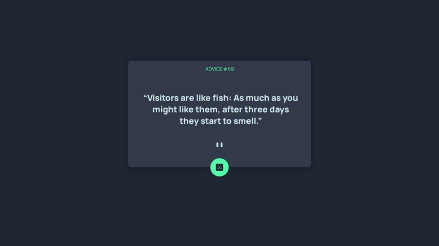
One challenge I encountered was creating a button with a background color while keeping the dice image intact. I overcame this by adding a div element with a background-color property behind the button element. While this works, I'd like to improve on finding a cleaner CSS solution to achieve the same outcome.
What specific areas of your project would you like help with?I'd appreciate some help with the CSS. I'm encountering an issue where the cards appear misaligned on certain screen sizes.
Community feedback
Please log in to post a comment
Log in with GitHubJoin our Discord community
Join thousands of Frontend Mentor community members taking the challenges, sharing resources, helping each other, and chatting about all things front-end!
Join our Discord
