Design comparison
Solution retrospective
I couldn't tell exactly but in the example pictures it looked like there was a pattern of horizontal lines in the background. I haven't added that to my project yet but I'd be curious if anyone else had tried to do it. Maybe it can be done with CSS repeating-linear-gradient?
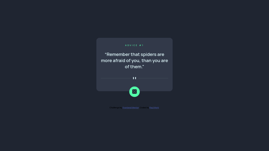
In my solution the box changes size depending on the amount of text in the response from the API. I'm not sure if that's a good practice or if it would be better to have the box remain a fixed size and instead resize the font to make the text fit.
I'd also be curious to know if anyone has a preferred ordering for their CSS properties. Mine are a spaghetti mess but I know there are conventions to follow, I just haven't been following them.
Community feedback
Please log in to post a comment
Log in with GitHubJoin our Discord community
Join thousands of Frontend Mentor community members taking the challenges, sharing resources, helping each other, and chatting about all things front-end!
Join our Discord
