Advice generator app solution using Pure CSS
Design comparison
Solution retrospective
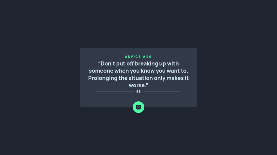
Added Little Spin Effect to the Dice Image. Check the StyleSheet for reference- Feedback and Suggestions will be very Valuable. Thank You
Community feedback
- @elaineleungPosted about 2 years ago
Hi Ravindra, nice spinning animation on the dice! 😊 One suggestion I have is to add
cursor: pointeron the dice icon so that users know it is interactive. Also, I'm viewing this on Firefox and for the first advice it took a while to load, and then the second one can't be loaded after I clicked on the dice. This is most likely due to Firefox's caching settings, and so if you want Firefox users to also use your app, you can try adding a header object in fetch, like this:const res = await fetch('https://api.adviceslip.com/advice', { cache: 'no-cache' });Lastly, for the mobile view, I think the component can use a bit more padding as the "advice number" line seems pretty close to the top of the component and the sides as well. Great work overall 😊
Marked as helpful1 - @ravindra135Posted about 2 years ago
I appreciate your feedback, thank you so much.
0
Please log in to post a comment
Log in with GitHubJoin our Discord community
Join thousands of Frontend Mentor community members taking the challenges, sharing resources, helping each other, and chatting about all things front-end!
Join our Discord
