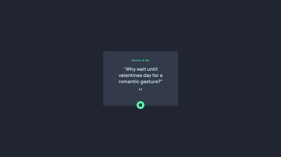
Design comparison
Solution retrospective
What I've learned in this challenge is how it helps new developers to fetch API more efficiently. and how to make a responsive design depending on the advice that appears in the box.
Community feedback
- @TedJenklerPosted 3 months ago
Hi @parykhan-jameel,
Nice project! However, it seems you might not have used a mobile-first workflow because the site isn’t fully responsive and breaks on most phones.
Think of your CSS as building a structure: if you start with the top of the house first, you’ll struggle to make the foundation stable. Currently, the design doesn’t look good at 375px, which is a common phone width. If your API earned you money per click, you could potentially lose more than 60% - 80% of the market share due to this issue.
Otherwise, you’ve done a great job. I’d recommend starting with a 375px design and then using media queries to handle other breakpoints.
I hope this feedback helps!
Best, Teodor
Marked as helpful1@parykhan-jameelPosted 3 months agoHi @TedJenkler, thank you very much for the feedback, I'll consider your comments in my upcoming solutions. Thanks again, Parykhan
1
Please log in to post a comment
Log in with GitHubJoin our Discord community
Join thousands of Frontend Mentor community members taking the challenges, sharing resources, helping each other, and chatting about all things front-end!
Join our Discord