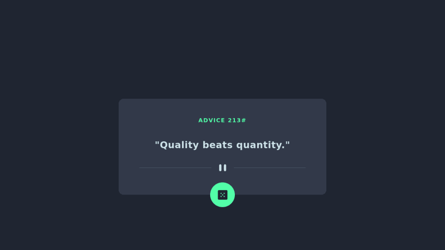
Design comparison
Solution retrospective
Greetings!
First submit on the Frontend Mentor website, feedback is needed :)
In this challenge I used the following: -React -Vite -TailwindCSS
Had problems with the container placement, and opted for a quick fix with a div in between.
Had lots of fun and learned a lot!
Community feedback
- @EduardIonescuPosted almost 2 years ago
Hi, nice job on the project.
You can give your
sectioncontainer these properties:display: flex; justify-content: center; align-items: center;I'm not used to Tailwind so you'll have to figure out how to implement them there, but this is what I usually do to center an element. Your idea with the div is pretty creative, but doesn't work on smaller screens.
I hope this helped!
Marked as helpful0@VNenad93Posted almost 2 years ago@EduardIonescu Hello Eduard!
Thank you very much for the helpful comment.
I've implemented the solution but didn't pushed it in the repository
0
Please log in to post a comment
Log in with GitHubJoin our Discord community
Join thousands of Frontend Mentor community members taking the challenges, sharing resources, helping each other, and chatting about all things front-end!
Join our Discord
