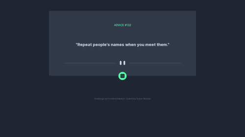
Submitted over 2 years agoA solution to the Advice generator app challenge
Advice generator app | Next.js | Tailwind
next, tailwind-css
@itush

Solution retrospective
Hello Developers👋
It was really a great project. I had the most fun developing the API and playing around with the advice generator.😄
As always, I'd really appreciate if you could answer the following:👇
1.What did I do wrong?
2.What did I do right and how to fix them?
3.How can I improve? common mistakes?
🙏Thanks in advance Happy Coding😄
Code
Loading...
Please log in to post a comment
Log in with GitHubCommunity feedback
No feedback yet. Be the first to give feedback on Tushar Biswas's solution.
Join our Discord community
Join thousands of Frontend Mentor community members taking the challenges, sharing resources, helping each other, and chatting about all things front-end!
Join our Discord