Design comparison
SolutionDesign
Solution retrospective
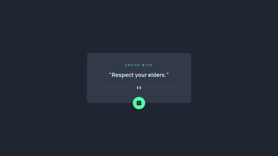
Hi everyone, this is my attempt at the advice generator app challenge. This challenge was fairly simple, and pretty fun to do.
To enhance user experience and prevent API call spam in a short amount of time, I disabled the button for 2 seconds upon fetching a new quote. I'd appreciate any feedback if there's any other things I missed in order to better enhance the solution. :)
Community feedback
Please log in to post a comment
Log in with GitHubJoin our Discord community
Join thousands of Frontend Mentor community members taking the challenges, sharing resources, helping each other, and chatting about all things front-end!
Join our Discord
