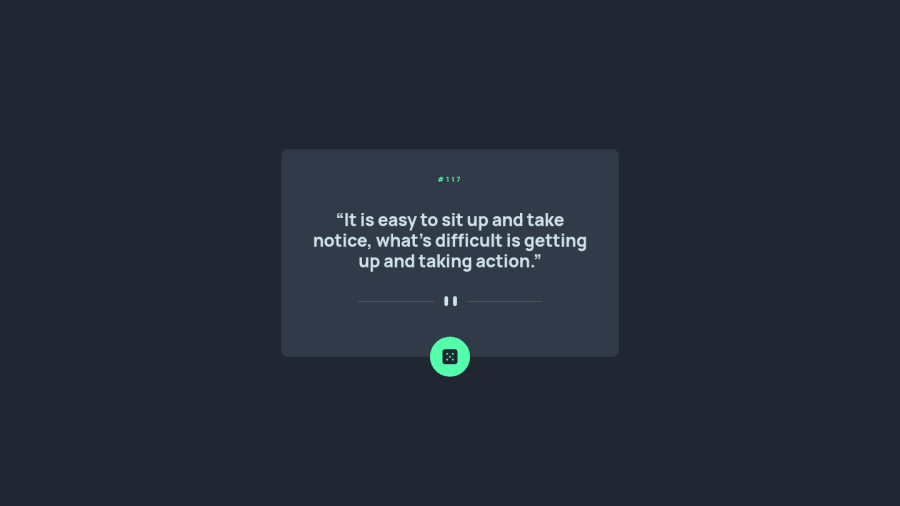
Advice Generator App Flexbox, and Vanilla JavaScript
Design comparison
Solution retrospective
This was my first "real" project using an API. Any comments or feedback is always appreciated :)
Community feedback
- @ApplePieGiraffePosted over 2 years ago
Hello there, Eileen dangelo! 👋
Nice to see you complete another challenge! 😀 Well done on this one! 👍
One small suggestion I have is to add some screenreader-only text to the inside of the button or add an
aria-labelinstead that describes the purpose of the button. This is important for accessibility reasons because there is currently nothing that screen readers can read to let users know what that button is for. If you'd like to learn more about creating elements that are visually hidden but can still be read by assistive technologies, check out this nice article.Hope that helps. 😊
Keep coding (and happy coding, too)! 😁
1
Please log in to post a comment
Log in with GitHubJoin our Discord community
Join thousands of Frontend Mentor community members taking the challenges, sharing resources, helping each other, and chatting about all things front-end!
Join our Discord
