

Design comparison
SolutionDesign

Solution retrospective
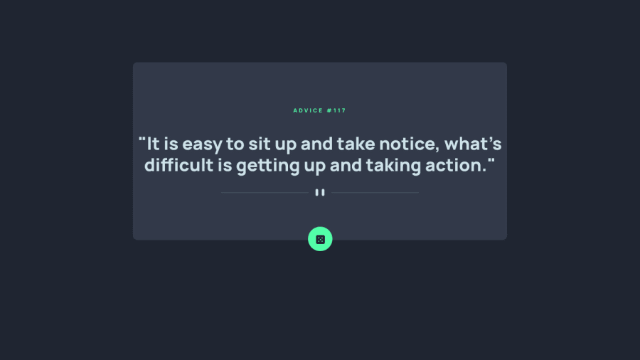
This is my solution for the Advice Generator App.
It was overall easy and enjoyable building this project.
I would appreciate your feedback and would like to receive your comments and perspectives regarding the project. Thanks a lot!
Community feedback
Please log in to post a comment
Log in with GitHub
Join our Discord community
Join thousands of Frontend Mentor community members taking the challenges, sharing resources, helping each other, and chatting about all things front-end!
Join our Discord