Submitted over 2 years ago
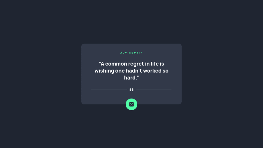
advice generator app developed with Typescript
#typescript
@YerikAH
Design comparison
SolutionDesign
Solution retrospective
Any feedback to improve my coding skills will be of great help to me. Thank you! 😀
Community feedback
Please log in to post a comment
Log in with GitHubJoin our Discord community
Join thousands of Frontend Mentor community members taking the challenges, sharing resources, helping each other, and chatting about all things front-end!
Join our Discord
