Design comparison
SolutionDesign
Solution retrospective
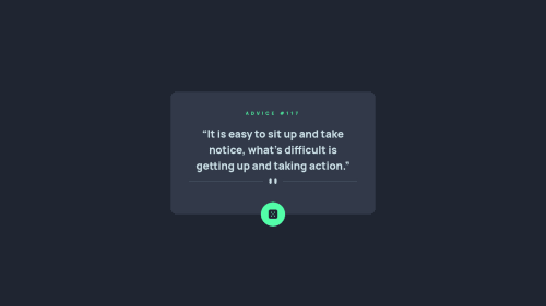
Here is my solution, any feedback or comment will be appreciated😄
Community feedback
- @JaneMorozPosted almost 2 years ago
Hey! I like your solution! ❤️ The button animation is awesome 🤩
The only things I've noticed:
- If you use button/link without any text (or with only image or icon), I suggest to add
aria-label
to the <button> (or <a>) tag to improve accessibility. You can read more about it here. Also you might want to addaria-hidden
tag for the image inside of the button. More about aria-hidden. For example:
<button aria-label="next advice" class="rounded-full p-5 bg-neonGreen absolute -bottom-[32px]"> <img aria-hidden="true" src="images/icon-dice.svg" alt=""> </button>
- You might want to put
<div class="attribution bg-darkBlue text-lightCyan font-manrope">
inside the <main> tag. It will solve this landmark issue and improve accessibility.
Keep it up! And good luck 🍀
Marked as helpful1@DytomaPosted almost 2 years ago@JaneMoroz Thank you for your suggestions, I've implemented it to my solution.
For the
<div class="attribution bg-darkBlue text-lightCyan font-manrope">
I would like to keep it to the bottom of the page😄.1 - If you use button/link without any text (or with only image or icon), I suggest to add
Please log in to post a comment
Log in with GitHubJoin our Discord community
Join thousands of Frontend Mentor community members taking the challenges, sharing resources, helping each other, and chatting about all things front-end!
Join our Discord