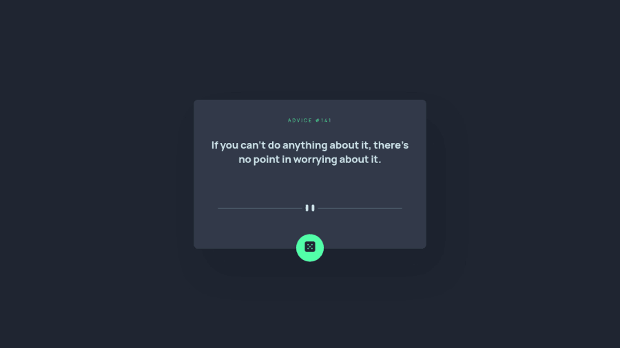
Advice generator app built with Vite. React JS+TypeScript.
Design comparison
Community feedback
- @AdrianoEscarabotePosted about 2 years ago
Hi Seb Arz, how are you?
I really liked the result of your project, but I have some tips that I think you will like:
1- Document should have one main landmark, you could have put all the content inside the
maintag click here2- All page content should be contained by landmarks, you can understand better by clicking here: click here
We have to make sure that all content is contained in a reference region, designated with HTML5 reference elements or ARIA reference regions.
Example:
native HTML5 reference elements:
<body>
    <header>This is the header</header>
    <nav>This is the nav</nav>
    <main>This is the main</main>
    <footer>This is the footer</footer>
</body>
ARIA best practices call for using native HTML5 reference elements instead of ARIA functions whenever possible, but the markup in the following example works:
<body>
     <div role="banner">This is the header</div>
     <div role="navigation">This is the nav</div>
     <div role="main">This is the main</div>
     <div role="contentinfo">This is the footer</div>
</body>
It is a best practice to contain all content, except skip links, in distinct regions such as header, navigation, main, and footer.
Link to read more about: click here
2- Why it Matters
Navigating the web page is far simpler for screen reader users if all of the content splits between one or more high-level sections. Content outside of these sections is difficult to find, and its purpose may be unclear.
HTML has historically lacked some key semantic markers, such as the ability to designate sections of the page as the header, navigation, main content, and footer. Using both HTML5 elements and ARIA landmarks in the same element is considered a best practice, but the future will favor HTML regions as browser support increases.
Rule Description
It is a best practice to ensure that there is only one main landmark to navigate to the primary content of the page and that if the page contains iframe elements, each should either contain no landmarks, or just a single landmark.
Link to read more about: click here
The rest is great!!
Hope it helps...👍
Marked as helpful1 - @correlucasPosted about 2 years ago
👾Hello @websebarz, Congratulations on completing this challenge!
I've just opened your live site and I can say that you did a great job putting everything together! There's some tips to improve your solution:
Your component is okay but it's missing the vertical alignment. The best way to do it is by using
flexbox. First step is to addmin-height: 100vhto make the body height size becomes 100% of the screen height, this way you make sure that whatever the situation the child element (the container) align the body and then use the flex properties for alignment withdisplay: flex/align-items: center;/justify-content: center;body { MIN-HEIGHT: 100VH; margin: 0; font-family: var(--ff-primary); background-color: var(--clr-dark); color: var(--clr-grayish-blue); display: flex; flex-direction: column; align-items: center; justify-content: center; }To reduce your css file and improve the performance loading your page you can use a tool called
css minifythat reduces the css code removing the unnecessary characters. You can use aVSCodeplugin calledminify cssor this website tool to reduce your code:https://www.toptal.com/developers/cssminifier✌️ I hope this helps you and happy coding!
Marked as helpful1@websebarzPosted about 2 years ago@correlucas Thank you Lucas, I'm going to fix this right away. It's very cool to see the advanced still taking care for begginers. Have a good one!
1@correlucasPosted about 2 years ago@websebarz Hey Seb, I'm not advanced bro I am like everyone here. Have a nice day bro =)
1 - @denieldenPosted about 2 years ago
Hi Seb, congratulations on completing the challenge, great job! 😁
Some little tips for optimizing your code:
- add
maintag and wrap the card for improve the Accessibility - remove all
marginfrom.container--elclass - add
font-weight: 800to the body orptag - use
buttonnotspanfor the button genetare - use flexbox to the body to center the card. Read here -> best flex guide
- after, add
min-height: 100vhto body because Flexbox aligns child items to the size of the parent container - instead of using
pxuse relative units of measurement likerem-> read here
Hope this help! Happy coding 😉
Marked as helpful1@websebarzPosted about 2 years ago@denielden thank you Deniel, I'm going to follow your tips for optimizing this code. It was very helpful. Have a good one!
1 - add
Please log in to post a comment
Log in with GitHubJoin our Discord community
Join thousands of Frontend Mentor community members taking the challenges, sharing resources, helping each other, and chatting about all things front-end!
Join our Discord
