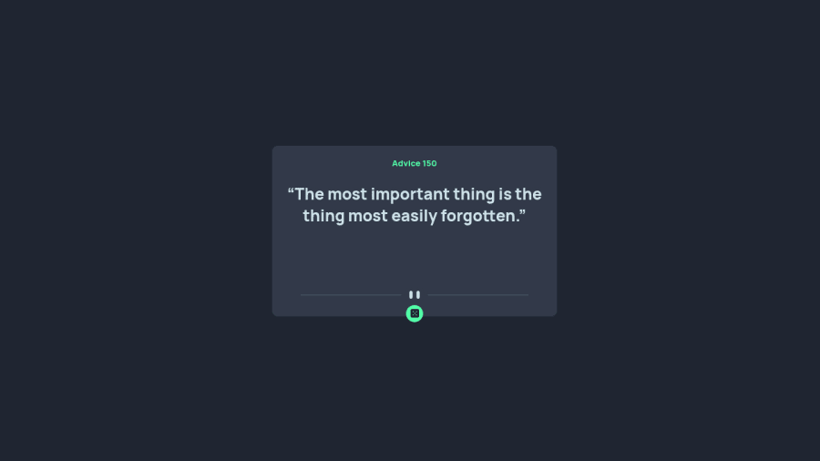
advice Generator App built with React Js
Design comparison
Solution retrospective
having Issues with the mobile layout of the app. your comment on the code will greatly be appreciated.
Community feedback
- P@12KentosPosted almost 3 years ago
Hey @obinneji,
Nice job on this project, it looks great! I looked through your code and noticed for the mobile section you added the following code to your media query.
height: 90vh;Was there a reason for doing this? If you remove this line of code, it immediately looks a lot better. Generally in most cases, it's better to let the content create it's own height rather than setting a fixed one.
Hope this helps, and keep up the great work!
Marked as helpful0@obinnejiPosted almost 3 years ago@12Kentos if the words in the advice are much it tends to display over the main container, especially in mobile view, that was why I extended the height to 90vh for mobile.
0
Please log in to post a comment
Log in with GitHubJoin our Discord community
Join thousands of Frontend Mentor community members taking the challenges, sharing resources, helping each other, and chatting about all things front-end!
Join our Discord
