Design comparison
Solution retrospective
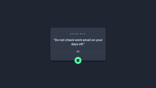
Hello, this is my solution for the "Advice Generator App" built with Open Props. I decided not to use any JavaScript framework for this app but instead opted to take advantage of the browser's native functionality by using the fetch API. As for the advice text, I believe that with the upcoming CSS property "text-wrap:balance", we will be able to achieve better balance with the automatic length of the text.
Community feedback
- @0xabdulkhaliqPosted over 1 year ago
Hello there 👋. Congratulations on successfully completing the challenge! 🎉
- I have other recommendations regarding your code that I believe will be of great interest to you.
HTML 🏷️:
- This solution generates accessibility error reports, "All page content should be contained by landmarks" is due to incorrect usage of
semantic
markup, which causes lacking of landmark for a webpage
- So fix it by replacing the
<figure>
element with the semantic element<main>
in yourindex.html
file to improve accessibility and organization of your page.
- What is meant by landmark ?, They used to define major sections of your page instead of relying on generic elements like
<div>
or<span>
- They convey the structure of your page. For example, the
<main>
element should include all content directly related to the page's main idea, so there should only be one per page
.
I hope you find this helpful 😄 Above all, the solution you submitted is great !
Happy coding!
0@mobaltiPosted over 1 year agoHello @0xAbdulKhalid , I have fixed the problem. However, I believe that the main tag may not be the most appropriate tag to represent this content, especially considering that there are no other sections in the app. Nonetheless, thank you for your help in identifying the issue! 👍
0
Please log in to post a comment
Log in with GitHubJoin our Discord community
Join thousands of Frontend Mentor community members taking the challenges, sharing resources, helping each other, and chatting about all things front-end!
Join our Discord