Design comparison
Community feedback
- @CheFernandez99Posted 10 months ago
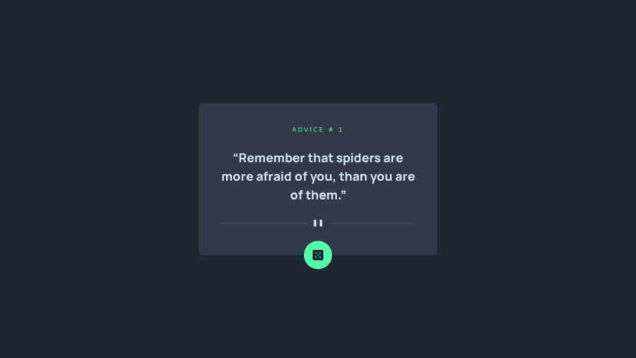
may i ask how you got that button to stay on the container as the container moves, im assuming you made the position absolute. I had an issue where the advice moving also moved the container and my button wouldn't stick to the container and move with it lik yours is
1@md-abid-hussainPosted 10 months ago@CheFernandez99 The button uses following tailwind css classes for style :
className="block bg-neon-green p-5 rounded-full max-w-max mx-auto translate-y-2/4"
block make the content block element
p-5 is for padding from all direction and 5 is for 1.25rem
rounded-full is to make the button circular
bg-..... is for background
mx-auto is for centering the button with respect to container by setting margin horizontal auto
translate-y-2/4 is to translate the button in y direction by 50%
max-w-max is to set the maximum width of button to maximum which is not required i think
So in short we have to make the button as a block level element then center it by setting horizontal margin auto and finally translate it in y direction by 50%
You can find the css related to classes in tailwindcss docs
1
Please log in to post a comment
Log in with GitHubJoin our Discord community
Join thousands of Frontend Mentor community members taking the challenges, sharing resources, helping each other, and chatting about all things front-end!
Join our Discord