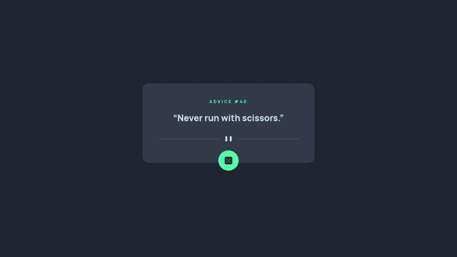
Design comparison
Solution retrospective
ANy feedback is welcome, especially for Javascript part. Thanks!!!
Community feedback
- @grace-snowPosted almost 2 years ago
Hi
I can’t use this because you’ve not used a button. I (and millions of others) won’t be able to interact with this unless you use interactive elements correctly
On mobile the top of the advice block is cut off. That’s probably because of the negative margin
Be careful how you’re using em. It can be dangerous because it goies off font size and compounds. You could lose control of your layout really easily using em so much
most important of all - font size must NEVER be in px. Use rem
0@volkanguneriPosted almost 2 years ago@grace-snow
The font-sizes that I've written in px are for HTML. Yhis is the use case of em and rem. That helps to increase only html font size in 1440px mediaQuery instead of every other font sizes one by one as i use em and rem. Other confirmed développeurs use and suggest this methode.(Kevin Powell, TraversyMedia etc.) But I would agree with you for percentages, vw and vh properties which can cause problems in huge screens as they ll take the screen as reference.
For the cut off problem it can also come from overflow:hidden; but i didn't use it. Actualle the negative margin i've just forgot to take it off. Now it's done. May be it resolves the prioblem. Even with that negative margin it works correctly on my different screens, also for other phones that I have on my responsive mode of computor.
For the button, that time I used à div instead of button and it works, I also saw that it was possible on a project bases development tutoriel. I also read on this article that the diference between div and button is a rough question and it seems that there is no consensus on that.
https://benfrain.com/we-need-a-better-button-its-too-slow-and-wont-behave/
Using div instead of button is another way to do it, so you avoid all the preconfiguration shit of buttons that you have to take off one by one, like no border, no text-configuration etc. so it allows same result with less code. Also you see in this article that divs seem like faster then buttons but it needs sophisticated researches.
Thank you so much for your comments :)
0
Please log in to post a comment
Log in with GitHubJoin our Discord community
Join thousands of Frontend Mentor community members taking the challenges, sharing resources, helping each other, and chatting about all things front-end!
Join our Discord
