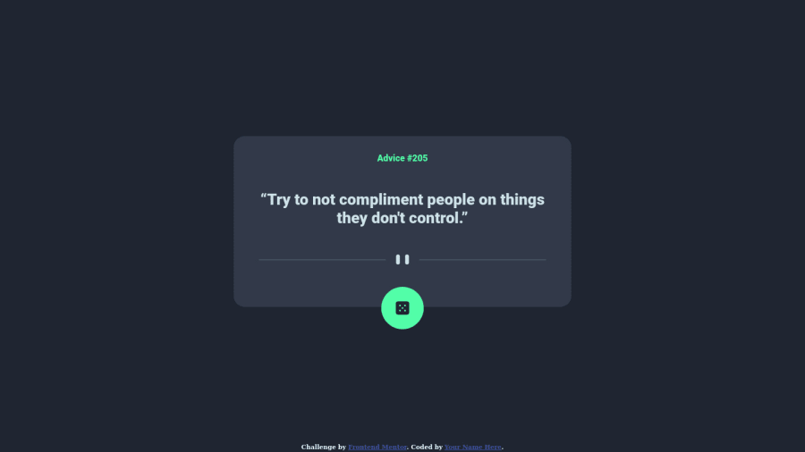
Design comparison
Solution retrospective
Helped me learn about positioning
Community feedback
- @shashreesamuelPosted over 2 years ago
Hey Jester, good job completing the Advice Generator App challenge.
Your solution looks great however I think that the advice number needs to be in the font family specified in the
style-guide.mdfile and it needs some line-spacing.In terms of your validation errors,
-
your image tags need alternative text by simply the
altattribute and specifying a description based on your image. -
Your document is unable to identify the main content of the page, simply wrap all the tags within the body element in a main element.
I definitely recommend using semantic html tags.
This helps by getting rid of accessibility issues specifically by describing the intended usage for the tags within it for example, the semantic tag footer describes that any tags within will be displayed within the footer section of the page, header tag describes that any tags within will be displayed on the header of the document.
In terms of your site, while previewing it I think that the following suggestions should be taken into consideration.
-
The font size appears to be a bit too big on my device
-
The dice button has a bit too much padding.
I hope this helps
Keep up the great work
Marked as helpful0 -
Please log in to post a comment
Log in with GitHubJoin our Discord community
Join thousands of Frontend Mentor community members taking the challenges, sharing resources, helping each other, and chatting about all things front-end!
Join our Discord
