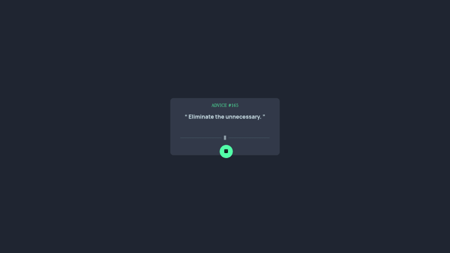
Design comparison
Solution retrospective
Q Is there any way to optimize the code. Q Also regarding centre the card. I follow the standard way to centre any element with respect to whole window " top: 50% ; left:50% transform(-50%,-50%)". But I like to understand the inner working how it centre it. Please Explain?
Community feedback
- @argelomnesPosted over 2 years ago
Hi @sahil899,
I think one way to optimize this is to not use font-awesome at all.
- Even though you only used it on 2 elements, browsers still need to load the whole library.
- The images to be used are provided in starter file
Here’s how that centering works:
top: 50%; left: 50%;50% here pertains to the viewport's dimension. So if the viewport is 980px wide, the card is moved 490px from the left. You may have expected the card to be centered already with this, but it's not. That's because the distance is between the viewport's edge and the card's top-left corner.This is where
transform: translate(-50%, -50%);comes in. 50% here pertains to the card's dimension and starts at its center. If the card is 350px wide, it's moved back 175px.. from its center.Marked as helpful2 - @naufalf25Posted over 2 years ago
Hello, for centering your card. You can using flexbox or grid Example :
Using flexbox : display: flex; justify-content: center; align-items: center; min-height: 100vh;
Or you can using grid : display: grid; align-content: center;
I hope my feedback can help you to improve your skills 😄
0
Please log in to post a comment
Log in with GitHubJoin our Discord community
Join thousands of Frontend Mentor community members taking the challenges, sharing resources, helping each other, and chatting about all things front-end!
Join our Discord
