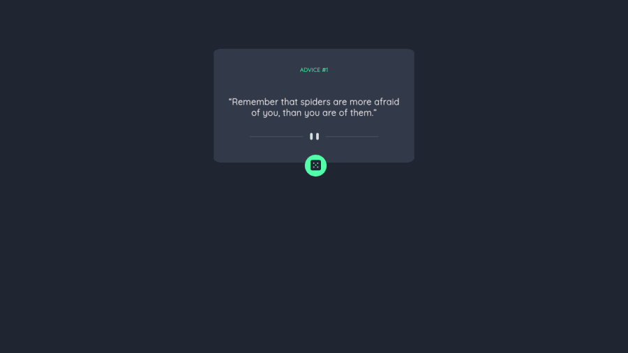
Design comparison
SolutionDesign
Community feedback
- @RioCantrePosted over 2 years ago
Hello there! Great work with this one. Regarding the solution you submitted, I think you should know the following notes…
- For best practice, place this line
titleor the last part inside theheadtag - Clean the whitespaces in the code
- Instead of
div, alternatively wrap the whole content with semantic tags, for HTML structures, refer it with this one Semantics - Remove unnecessary code to keep it clean
- Include
altwith description in image tags. Like this line<img src="./images/pattern-divider-mobile.svg"/> but that's optional. Alternative is to use it assvg` like the dice (which is commented above, why? you can add the sizing properties in the CSS style part) - Modify the padding in the
.displayrule set intopadding: 0 1.9rem 3rem;
Other than that...
- The JS functionality is working well
- Great use of the API, the main button generates random quotes when clicked
- The hover state shows the glowing effect of the design
- The HTML structure is readable
- The CSS style is properly done. For next project, make a separate file for the styling
- The project is responsive and utilized the details based on the original design
ADVICE #30 "When in doubt, just take the next small step."
Above all, The project is awesome! Keep it up!
Marked as helpful0@kirtymeenaPosted over 2 years ago@RioCantre Thanks for the feedback. It was very helpful.
0 - For best practice, place this line
Please log in to post a comment
Log in with GitHubJoin our Discord community
Join thousands of Frontend Mentor community members taking the challenges, sharing resources, helping each other, and chatting about all things front-end!
Join our Discord
