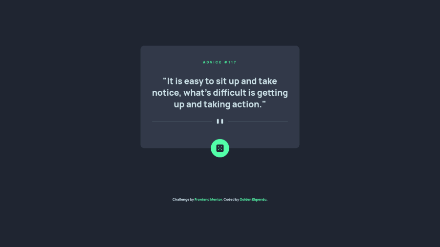
Design comparison
Solution retrospective
I'd love to get constructive criticism on this
Community feedback
- @MelvinAguilarPosted almost 2 years ago
Hi there 👋. Good job on completing the challenge ! I have some feedback for you if you want to improve your code.
HTML:
- Use the
<main>tag to wrap all the main content of the page instead of the<div>tag. With this semantic element you can improve the accessibility of your page.
- Use the
<footer>tag to wrap the footer of the page instead of the<div class="attribution">. The<footer>element contains information about the author of the page, the copyright, and other legal information.
- Adding functionality to non-interactive elements like
divorimgis not recommended because they are not designed to be interactive. You should use interactive elements likebuttonto make your elements interactive.
- When you change "<div id="dice">" to a button there is another problem: There isn't much information about what the button is for, and
icon-diceas thealtattribute value is not very descriptive, screen reader users will hear "Button, icon-dice" and they won't understand what the button does. You can useGenerate new adviceas thealtattribute value. You can see an example here.
-
Not all images should have alt text. The divider image is a decorative image, it does not add any information to the page. You should use an empty
altattribute instead of a descriptive one. You can read more about this here. -
In light of the fact that I am currently able to spam it with clicks, it would be helpful if you could add a delay of for example 2 seconds, block the button, and with the setTimeout function enable the button again after 2 seconds.
- Instead of using pixels in font-size, use relative units like
emorrem. The font-size in absolute units like pixels does not scale with the user's browser settings. This can cause accessibility issues for users who have set their browser to use a larger font size. You can read more about this here.
- The
width: 100%property in thebodytag is not necessary. Thebodytag is a block element and it will take the full width of the page by default.
- Use
min-height: 100vhinstead ofheight: 100vh. Theheightproperty will not work if the content of the page grows beyond the height of the viewport.
I hope you find it useful! 😄 Above all, the solution you submitted is great!
Happy coding!
Marked as helpful0@goldenekpenduPosted almost 2 years ago@MelvinAguilar thanks a lot. I'll take note of these. Thanks again Melvin
0 - Use the
Please log in to post a comment
Log in with GitHubJoin our Discord community
Join thousands of Frontend Mentor community members taking the challenges, sharing resources, helping each other, and chatting about all things front-end!
Join our Discord
