Design comparison
SolutionDesign
Community feedback
- @zineb-BouPosted over 2 years ago
Hi there, Good job on this challenge I would love to drop some comments that may help you to improve your coding skills even further
- Choose the right HTML semantic element, you have chosen only
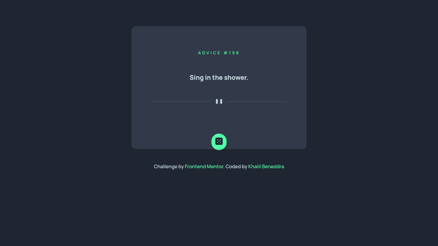
<div>to most of your elements, for instance instead of using a<div>for the dice button use a<button>because it’s an interactive element. - When scaling down to small screens the pattern divider is not fitting anymore within the advice container try to fix that and make it more responsive.
- It is better to give your solutions an
<h1>every website need to have an<h1>title, in this case, it is a bit subtler, so you can choose<h1> Advice generator</h1>then make itsr-only(screen reader only ) since there is no<h1>in the design .
Good luck
0 - Choose the right HTML semantic element, you have chosen only
Please log in to post a comment
Log in with GitHubJoin our Discord community
Join thousands of Frontend Mentor community members taking the challenges, sharing resources, helping each other, and chatting about all things front-end!
Join our Discord
