Design comparison
Solution retrospective
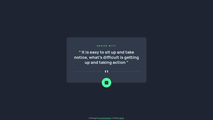
Although this is my first project with data fetching, I'm not new to javascript promises, so this project is not that hard to complete. Also the project design is very simple, there's almost no difference between the desktop and mobile view.
I didn't go overboard with the loading, because I feel like toomuch animation will not suit the simple design of this project (naah, I'm just not that good at thinking up beautiful design LOL). I just set the max-width of the <div class="advice"> to 0 while waiting for the data. I also set a minimum of 1 second loading time because sometimes the data is fetched so fast.
BTW, I did consider fetch error, so if you wanna see the error message just enter this on the console "link=''" and click the button. I declare the link variable globally for easy testing.
If you have suggestions or feedback about my solution, please comment below. It really helps me to improve my codes. Thanks
Community feedback
Please log in to post a comment
Log in with GitHubJoin our Discord community
Join thousands of Frontend Mentor community members taking the challenges, sharing resources, helping each other, and chatting about all things front-end!
Join our Discord
