Submitted over 1 year agoA solution to the Advice generator app challenge
Advice Generator App - Typing animation Next React Tailwind Framer
motion, next, react, tailwind-css, typescript

@shalri
Solution retrospective
What are you most proud of, and what would you do differently next time?
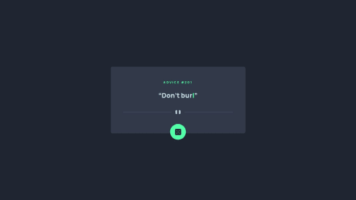
I sprinkled some Framer animations for UX/UI enhancements. I implemented a typing animation to display the advice. I am quite pleased with the result.
This challenge also showed the importance of a .fig file. I spent most of the time
pixel-pushing to set the dimensions, spacing, and layout just right. I am proud of the results since I was only eyeballing it.
This challenge was straightforward. I enjoyed playing around with the API.
What specific areas of your project would you like help with?I am good for now. Learning and having fun with these challenges...
Code
Loading...
Please log in to post a comment
Log in with GitHubCommunity feedback
No feedback yet. Be the first to give feedback on shalri's solution.
Join our Discord community
Join thousands of Frontend Mentor community members taking the challenges, sharing resources, helping each other, and chatting about all things front-end!
Join our Discord