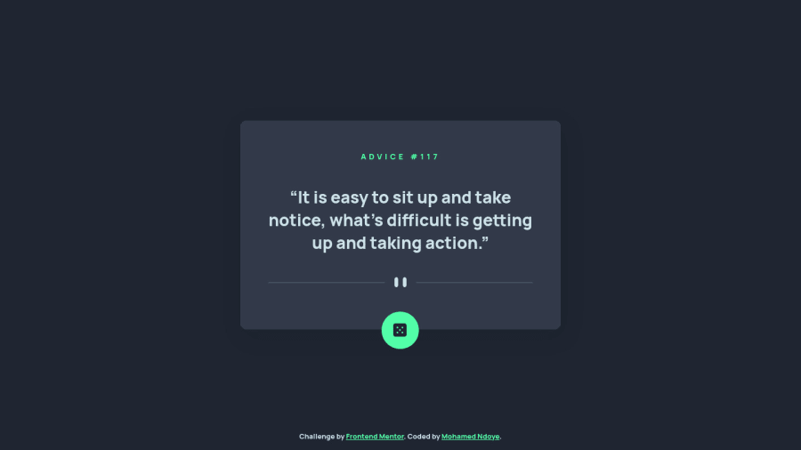
Design comparison
Solution retrospective
Feedbacks welcome!
Community feedback
- @samuelpletainPosted over 2 years ago
Good job, it looks really good. Your animation for the hover is great and your code is really clean and organized.
Here are a couple of things that could improve your app:
- Your layout is not centered when the width is between 601px and 1199px
- Your footer positioning is off is you resize the window vertically, overlapping the content if the height of the window is inferior than the size of the card
- The quotes on the original design are curvy, not straight
- The disabled animation is a bit too long in my opinion, but that is just personal preference.
Marked as helpful1@mohamed-ndoye811Posted over 2 years ago@samuelpletain Thanks a lot for your review !
And thanks for the feedback, I will fix everything when I have the time 🙂
And yes the disabled animations is long because on the api's website they say that they have a 2 second cooldown. So to avoid the confusion of having the same quote on two click I made sure to get the correct cooldown 😅
I personally find it very long too to be completely honest I may take it down to 1.5s
0 - @shashreesamuelPosted over 2 years ago
Hey good job completing this challenge, keep up the good work
Your solution looks good however I think that your divider line needs some margin from the bottom using
margin-bottomI hope this helps
Cheers Happy coding 👍
1
Please log in to post a comment
Log in with GitHubJoin our Discord community
Join thousands of Frontend Mentor community members taking the challenges, sharing resources, helping each other, and chatting about all things front-end!
Join our Discord
